Millions saw the apple fall, but Newton was the one who asked why.
Bernard Baruch

DISCLAIMER: In this article, I will be dealing with the leadership lessons one could learn by observing the management of this Pandemic. For a review of how we got to a Global Pandemic, please read my earlier piece on Combating Coronavirus Misinformation. I am not a medical professional, so for the medical aspects of the virus, I would refer you to coronavirus.gov or CDC.gov.
What leadership lessons can we learn by exploring the state of Coronoavirus management?
How can we measure Performance?
How do we know good results from bad results?
And, finally, did anyone do an excellent job of managing the situation?
Good questions.
The answers are probably not what you expect, though.
You might be surprised by the real facts.
These questions are not very different from the kinds managers should ask as they try to unpack their business results.
So in this piece, I will attempt to provide answers specific to the COVID-19 Pandemic. I will also draw out implications as a citizen and then as a business leader.
- The State of The Coronavirus Pandemic Worldwide
- What were the Pandemic Management Leaders Goals?
- The Importance of the right metrics
- Some COVID-19 Metric Choices Can Be Misleading
- The number of confirmed cases is interesting but not insightful.
- All Coronavirus Cases Don’t Pose Equal Risk.
- Focus COVID-19 efforts on the elderly!
- The Most Insightful Metric on COVID-19 Performance is the fatality rate of those at risk.
- Global Performance on protecting the 65 years or older from COVID-19
- USA State-Level Performance on protecting the 65 years or older from COVID-19
- Who did an excellent job managing COVID-19 in the USA?
- Results matter
- Nursing Home Performance – Just Politics?
- How well did the strategy work?
- Leadership Lessons Learned
- Sources and References
- Additional Charts
The State of The Coronavirus Pandemic Worldwide
On the very day, I began writing these words; we surpassed Ten Million confirmed cases (10,000,000) and Half a Million fatalities (500,000) worldwide from COVID-19.
That’s terrible.
Even more troublesome?
The reality of those two counts is worse than those official numbers.
Some jurisdictions have deliberately undercounted or obfuscated their numbers. Others just can’t do an accurate count. Finally, there is the problem of discovering the actual number of infected, rather than the ones tested and confirmed.
How much worse?
We don’t know, and we may never know.
We can always use more accurate data.
But in real life, we have to use what we have.
I started exploring the details used for this article a while ago. As one would expect, because of data lags, and my generally slow analytic pace, the results are based on data a few days old.
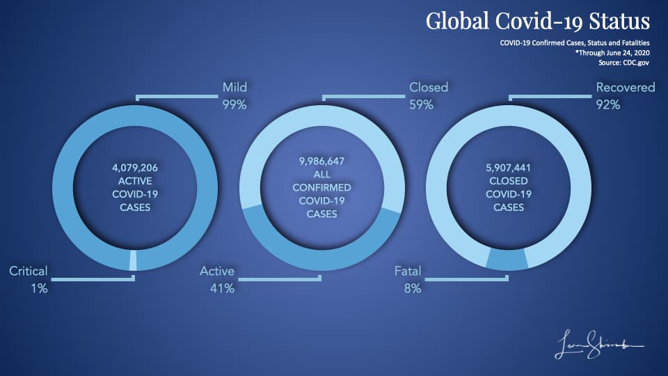
The majority (59%) of the confirmed cases identified so far have been resolved or closed. (See the donut in the center of the chart).
92% of those cases ended with a recovery (Five and a half million to date). (See the donut on the right).
8% of the closed cases resulted in a fatality (the Half a Million).
Of the approximately Four Million cases still open, 1% are considered Critical at this point. (See the donut on the left).
If the critical rate holds as those cases are closed, that will drive the fatality rate dramatically lower.
Wait a minute.
Setting aside the fact we had a large number of fatalities, the situation sounds like good news, right?
That certainly does not fit the doomsday picture continuing to be painted by public officials and the media. Right?
Indeed, in the USA, the media appears to be predicting a surge in new cases. With the underlying implication that there will be a corresponding increase in fatalities. Thus, the need for more continuing restrictions.
We need to explore that disconnect because surely there is the possibility that the micro situations will be dramatically different from the macro picture.
I know that we want to dig into the micro picture and determine how real progress looks like. But before we can do that, we need to discuss the goals and how we can measure progress.
What were the Pandemic Management Leaders Goals?
It’s difficult to discern the actual goals in the current environment. Not if we use the conversations and data getting the most attention.
In my view, the overarching goal was to:
Minimize fatalities from the Coronavirus.
However, since we knew at an early stage that the virus was most dangerous to the elderly, I would modify the goal to:
Minimize the fatalities from COVID-19 among the most affected (or at risk).
This goal is critical. When you assume everyone is equally at risk, One might create poorly targeted solutions. With a laser focus on those at risk in the community, we will force a confrontation of the challenge and specifically tuned solutions. We will see how this plays out later.
To achieve the above goal, the leaders created supporting strategies and corresponding goals.
The primary strategy was to flatten the curve to keep hospitalizations below the healthcare capacity.
One could accomplish this strategy by increasing healthcare capacity through additional beds and ventilators, reducing the number of cases, or combining both.
We will explore how well the USA implemented that strategy later.
But, hospitalizations from Coronavirus have been well below capacity, and in many places, excess surge capacity exists.
In implementing the strategy, the leaders focused heavily on cases.
That was right, for a time.
Here is what I said in my earlier piece published on March 19 titled “Combating Coronavirus Misinformation:”
Important Note: On the case chart, there will be a moment in time when the cases will spike due to a change in counting source. The early cases will come from medical situations. Later there is typically a switch to public or external testing. At this point, people who don’t show symptoms or who don’t necessarily show up for medical care will be identified as cases. This spike in cases does not mean a similar spike in fatalities.
I was saying that the value of using cases as a metric will decline in time.
Was I right? Are cases still relevant, or have they lost their value in informing management actions?
Read on.
The Importance of the right metrics
In my 30 plus years of transformation, I am always surprised by the shortage of critical data analysis.
Failing leaders look at data all the time. They have metrics that they used to guide them, yet they can’t find their way out of the puzzle.
My experience points to three typical challenges.
- Looking at the wrong metrics
- Misinterpreting what they mean, or
- Failing to devise suitable creative strategies for dealing with the problem
Key Metrics are essential.
They have diagnostic power; they illuminate challenges and lead the path to actionable strategies.
Key metrics are also comparable across leaders.
Let me give you an example.
Profit dollars are useful to measure, but not comparable across small and large divisions. One would naturally expect the larger divisions to generate more profits.
Profit margins (measured as a percent of sales) are useful to measure, but nor comparable across divisions. Some divisions might be competing in a high margin market while another is in a low margin market.
Profit returns (profit measured against the net capital invested) are useful to measure and compare. They reflect the managers’ ability to generate profit based on the amount they have invested.
So how does this apply to the Pandemic?
Glad you asked.
Some COVID-19 Metric Choices Can Be Misleading
Some metrics are easy to collect and easy to understand.
But are they reliable?
Do they tell us anything valuable from a management perspective, or are they so variable that they could have many causes?
Let’s take a simple question we would love to answer.
How likely is someone to die if infected with COVID-19?
It’s a straightforward question, but difficult to answer. Why?
Well, that requires us to know the actual infection fatality rate of COVID-19. That is the measure of fatalities divided by the number of those infected.
The problem? We don’t know the real number of infected people.
All we know are the number of people that have been tested and confirmed.
The ten million confirmed cases could represent twenty or one hundred million actual infections. We don’t know.
However, we know what is called the case fatality rate. It is calculated by dividing the number of fatalities with the number of diagnosed cases.
Right now, the case fatality rate globally is about 5% (500,000 fatalities on 10 Million cases).
In fast-moving pandemics, the case fatality rate is probably not even close to the actual risk to an infected person.
So what we want is the infection fatality rate, but what we have is the case fatality rate, which is a subset. Except we don’t know if it’s a big or small subset. And may never know.
The number of confirmed cases is interesting but not insightful.
The media loves to report on new cases.
Today record cases reported in a particular state must mean they are in trouble.
And the reduced number of cases in another state must mean they are doing well.
Is that reality?
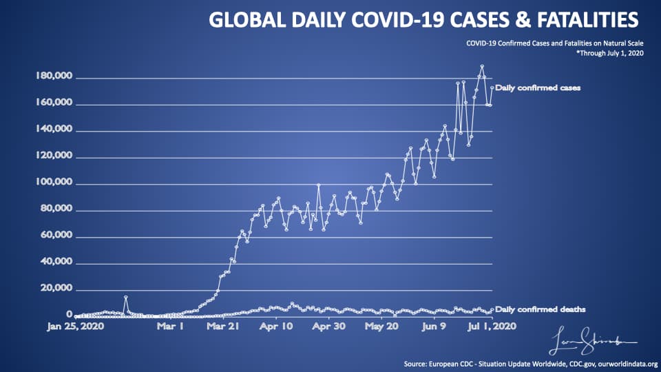
Look at the chart above, which shows the global number of daily cases (the higher line) and the number of fatalities (the lower line).
Since March, the number of cases has grown dramatically without a corresponding increase in fatalities.
Remember what I said earlier? The first case occurred when patients came to a hospital with symptoms. The later instances happened when we went out and started testing. Essentially, we began finding people who had been infected with COVID-19, but not necessarily needing hospitalization or resulting in a fatality.
I want to zoom in a little on this chart using a different scale. This chart uses a logarithmic scale. On a natural scale, each horizontal stripe represents the same amount (20,000 in the above diagram). In a logarithmic chart, each slice represents ten times the amount of the lower strip.
Let’s look at the logarithmic chart of the above data.
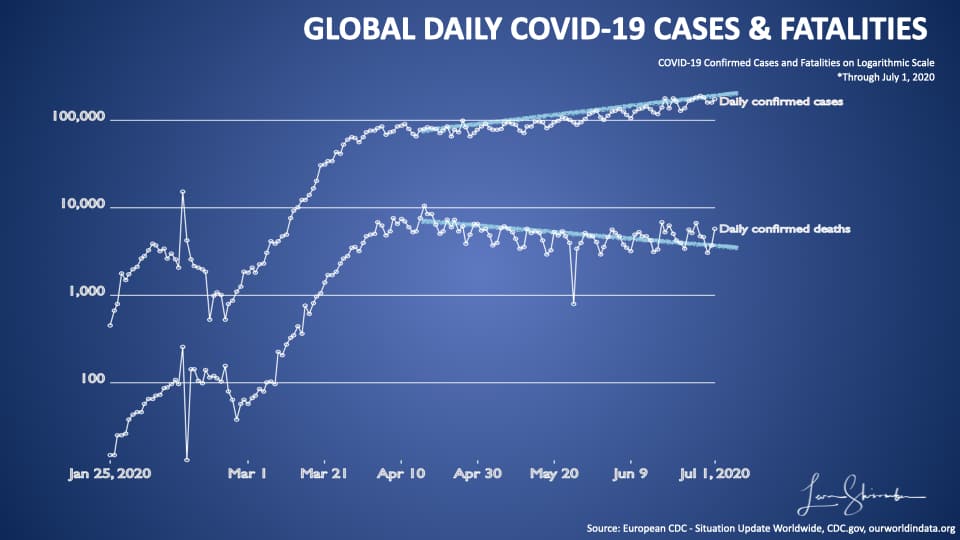
Here you can see the first stripe is 100 units. The second stripe is at 1,000. It’s a useful method for zooming into charts that have large scale data variations.
On this chart, I have drawn two trend lines for cases and fatalities from about mid-April.
Here you can see the divergence between cases continuing to rise, and fatalities declining.
The same is true for the USA!
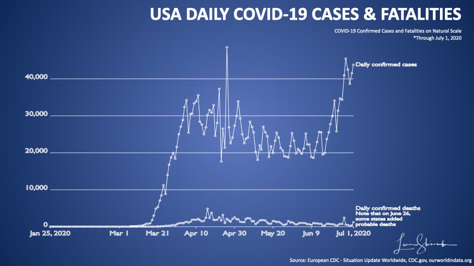
Since about March new cases lost their value as an insightful metric in the USA.
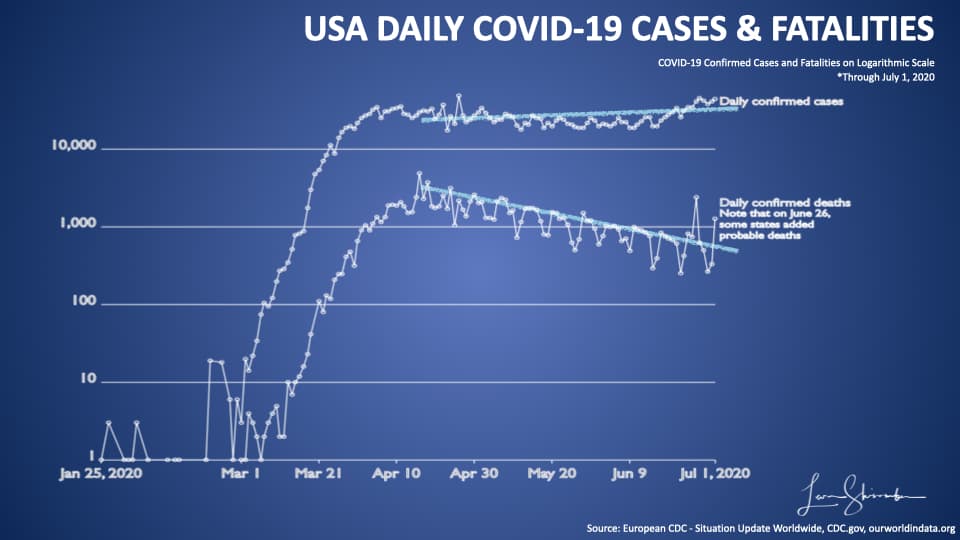
And, since mid-April, the trends between COVID-19 new cases and Fatalities have diverged. New cases continue to increase, while fatalities continue to decline.
Why is that?
The simple answer is mostly about who was an early case, versus now.
All Coronavirus Cases Don’t Pose Equal Risk.
That’s right.
All cases are not equal. To show you this point, I will have to use some microdata. Fortunately, we have data from one of the most transparent health reporting states, Florida.
I think the Florida data will illustrate this issue best.
Let’s start by looking at cases they have confirmed through June 24.
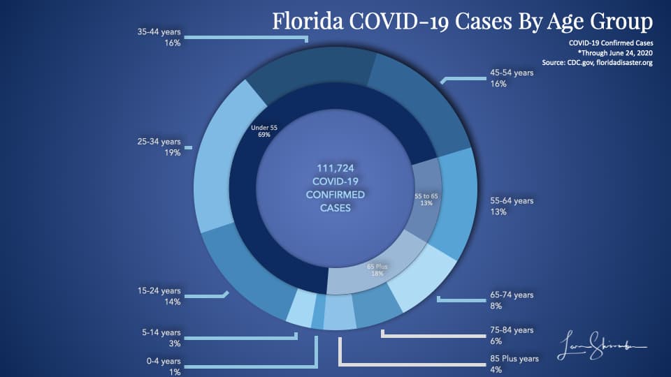
In the chart above, the outer ring shows the percent of Florida’s total confirmed cases by age group. Those 85 years or older represented 4 percent of the cases.
The inner ring shows the same percents grouped by a broader range of ages. So 69 percent of the confirmed cases in Florida were under 55 years old.
Only 18 percent of the cases were 65 years or older.
So what about hospitalizations?
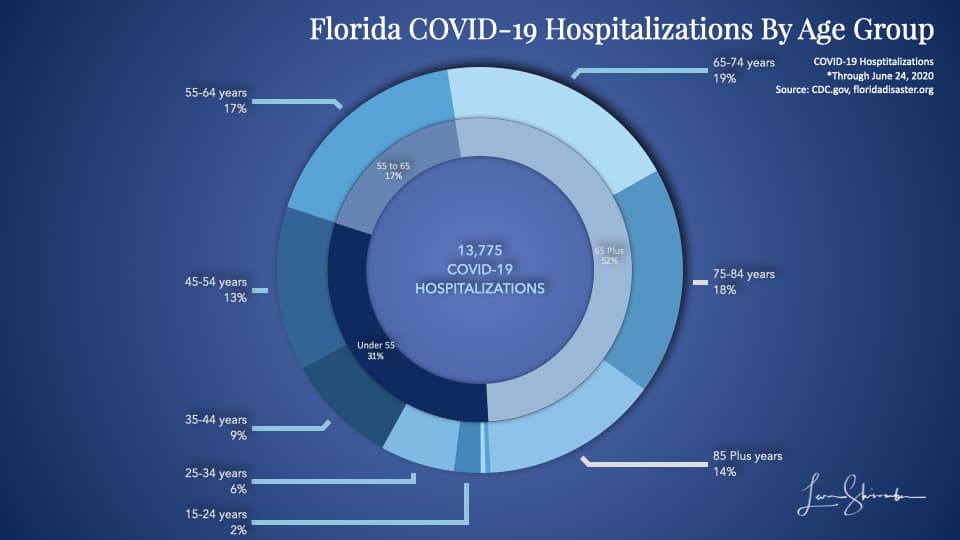
The previous 4 percent cases are now 14 percent of hospitalizations for those 85 years or older.
The 69 percent of cases for those under 55 years old have shrunk to 31 percent of hospitalizations.
Age is critical in determining the risk of hospitalization.
And fatalities
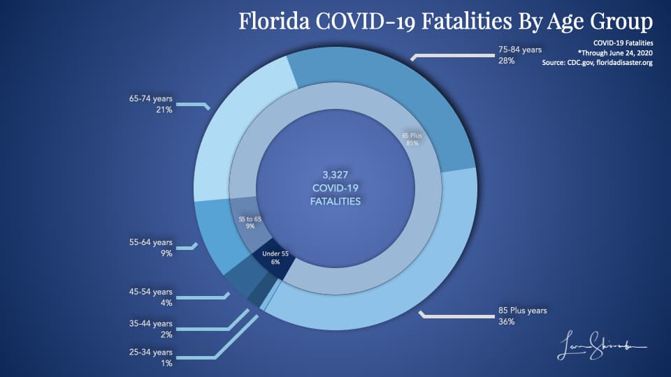
The 4 percent of cases, which were 14 percent of hospitalizations are a full 36 percent of fatalities.
Under 55 years old represent only 6 percent of the total COVID-19 fatalities in Florida.
This diagram is what those three charts look like when we put them together.
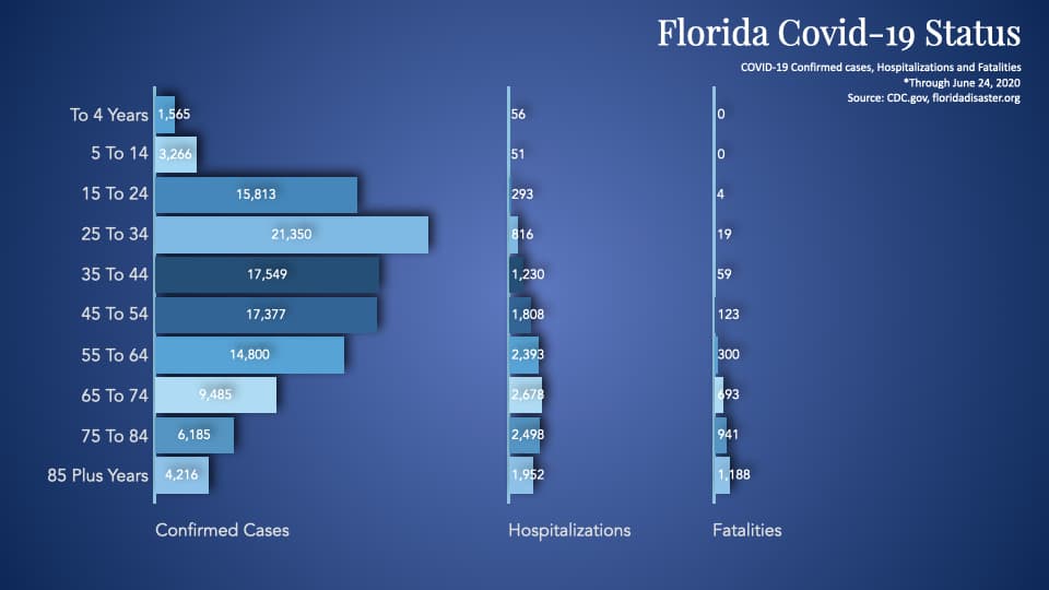
As we continue to test, we are going to find more cases that are young people. And when we do so, we won’t expect to see a corresponding spike in hospitalizations or fatalities.
It would be far more insightful to tell us how many new cases were in the risk group.
Or we should be talking about hospitalizations or fatalities, which are far more insightful.
Focus COVID-19 efforts on the elderly!
COVID-19 is a deadly disease.
But COVID-19 is not as deadly to some as it is to others.
Remember this goal stated above?
Minimize the fatalities from COVID-19 among the most affected (or at risk).
Knowing who is at most at risk is critical.
Every manager knows the Pareto rule. We should use it to our advantage in managing the Pandemic also.
Does the Florida picture shown above hold at the national level?
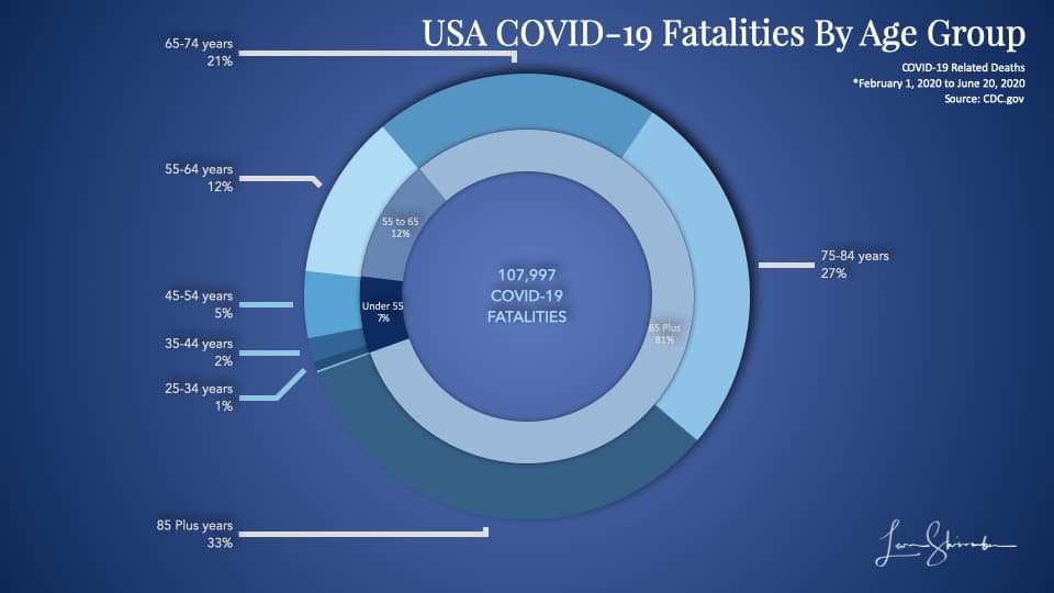
Yes, it does.
In the USA, 93 percent of COVID-19 fatalities were 55 years or older. Only 7 percent were under 55 years old.
But that does not show how fatal it is to each age group, just that the majority of the elder were fatalities.
Let’s look at the COVID-19 case fatality rate by age groups in the USA.
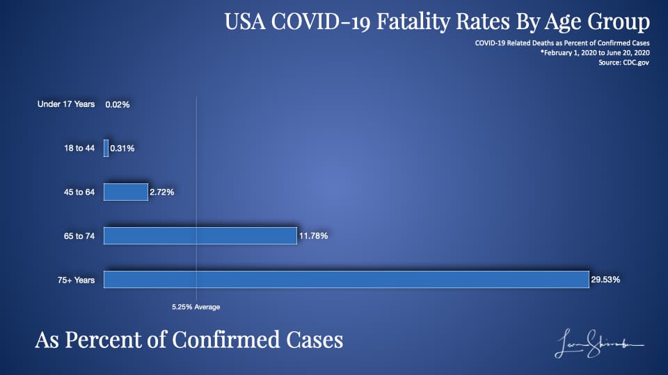
You can see the average fatality rate of confirmed cases in the USA by the vertical bar at 5.25 percent.
Nearly 30 percent of those over 75 who were confirmed cases were fatalities to COVID-19.
So what the confirmed cases data shows is that:
COVID-19 is approximately 1,500 times more deadly for 75 plus years old than to those under 17 years.
It is approximately 95 times more deadly for 75 plus years old than to those 18 to 44 years old.
COVID-19 is approximately 600 times more deadly for those 65 to 74 years old versus those under 17 old.
It is approximately 40 times more deadly for those 65 to 74 years old versus those between 18 and 44.
The real numbers are probably a lot higher.
Why? Because we are only using confirmed cases, and you may recall the problem we discussed earlier regarding case fatality rates.
The younger folks are more likely to be undercounted as cases than the older people.
The bottom line is that our at-risk population is the elderly.
And, the only question is where you want to draw the line.
Using Pareto, we can focus on 55 plus years old. This group accounted for 93 percent of the USA’s fatalities. Or we can use the 65 plus group, which represents 81 percent of the deaths.
An Important Note
I am not saying that we should ignore the impact of COVID-19 on the young.
To be sure, there will be many fatalities from the younger population, but at dramatically lower rates than the elder.
I am saying that by focusing on all fatalities and all cases, we will make some progress. But there is an opportunity cost of lost focus on the critical goal – concentrate on those at risk.
This apparent myopia or misfocus will become evident shortly.
The Most Insightful Metric on COVID-19 Performance is the fatality rate of those at risk.
If the goal was to protect those at risk, then the goal must be to minimize the fatalities among your at-risk population.
We can say the at-risk population is 55 or older. Ninety-three percent of COVID-19 fatalities in the USA are in that age group. We can then calculate fatalities per million in that age group. We can draw the line at 65 or older also and do the same.
An Important Note
To be most precise, we should only use fatalities from those age groups. So we should only use deaths 55 and older against the population 55 and older. Same for 65. But some of those numbers are not reported with granularity and challenging to get for every location. Remember that the deaths for those age groups are an extremely high proportion of the total (93 percent over 55, and 81% over 65). Despite the small overstatement, the numbers are still highly comparable. Indeed, they are a lot more comparable than taking all fatalities per million total population.
Using COVID-19 fatalities per million at-risk populations is a good way for us to compare Performance.
Let’s take a look at this at a global level, and then by the USA state.
Global Performance on protecting the 65 years or older from COVID-19
First, let’s look at the national comparisons.
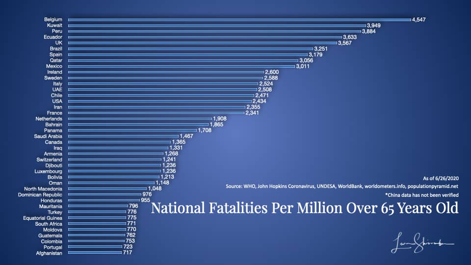
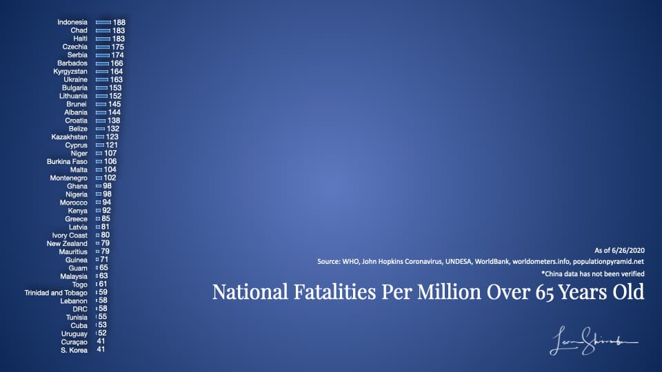
The first group is shown in this diagram. They include 41 countries with the highest fatality rates from COVID-19 per million in the 65 and older age group.
This group ranged from a low of 717 to a high of 4,547.
Belgium experienced 4,547 fatalities for every million 65 years or older in the country. As of this analysis, Belgium had 9,732 deaths and slightly more than 2.1 million over 65.
If you live in Kuwait, you know that Kuwait has not had 3,949 fatalities. It only had 344. Kuwait also does not have a million people 65 years or older. Those 344 fatalities, given its current population, translate to a rate of 3,949 if there were a million.
This statistic may be a little confusing, but the creation of a rate is necessary to normalize everybody. Each country has different populations, and we are adjusting their fatalities to what it would be for one million.
Think of it this way; if each country had a million people over 65 years old, how many fatalities would it have?
So, a country with one fatality on 100,000 has the same result as another country with ten deaths on one million. They would both be measured as 10 per million. And they would be the same as a third country with 100 deaths on 10 million.
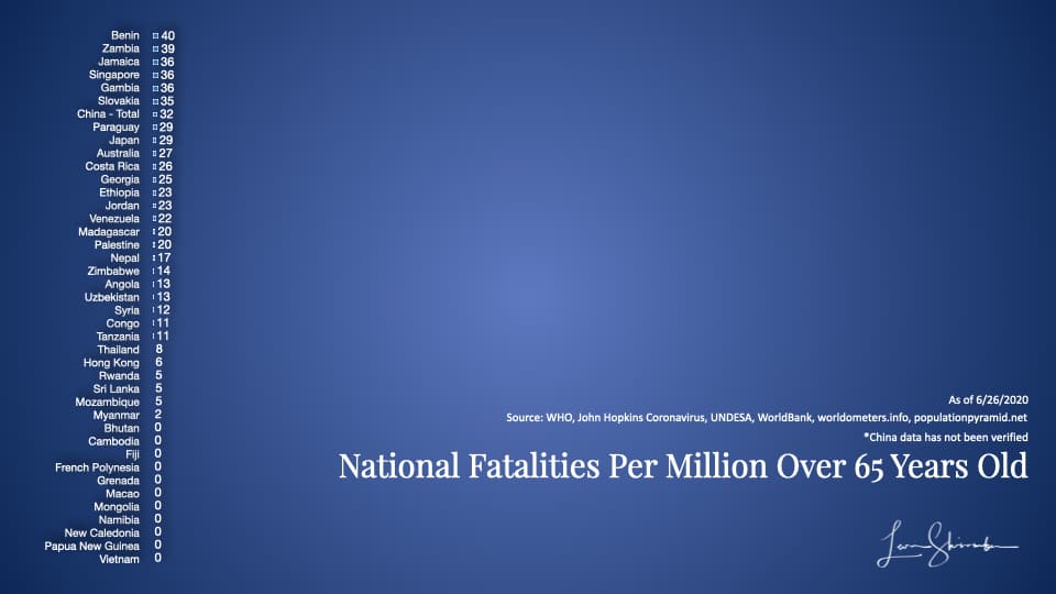
Here is the second group (the rest are at the bottom of the article).
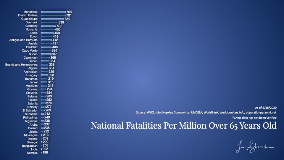
In the second group, the range was between 183 and 704.
Unfortunately, there is some issue of how accurately each nation is recording and sharing their actual fatalities.
But we know which ones are generally more transparent, and at least we can work with those.
There are a lot of factors that go into the variations to be sure. From connectedness to the rest of the world to how dense the population, all these factors create a variance.
Take New Zealand, for example. Their fatality rate was 79 per million over 65 years old. But New Zealand is very remote, a geographically spread out country with many isolated residents.
Att 41 fatalities per million over 6, South Korea, is quite geographically close to China and densely populated.
These countries did something different and better when focusing on protecting their elderly. They were dramatically better than the average at 774 or Belgium, Kuwait, The USA, and Canada, all on the top list.
USA State-Level Performance on protecting the 65 years or older from COVID-19
We can apply the same analysis with much more certainty about the data at the USA state level.
Here is what it shows.
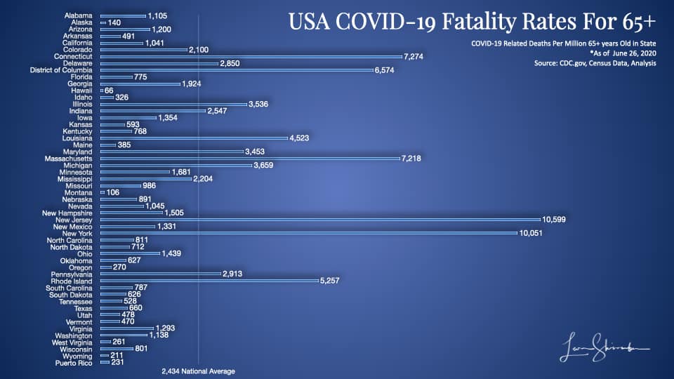
You can see in this diagram the dramatic variability across the states. They vary from a low of 66 in Hawaii to a high of 10,559 in New Jersey.
We finally have some baseline data that is somewhat comparable that we can use to compare state performance in managing COVID-19.
Who did an excellent job managing COVID-19 in the USA?
The Governor of New York, Andrew Cuomo, has been seen as a steady hand. He is the public face every day, running the New York effort to manage the Pandemic.
During the peak of the cases, the national media picked up his daily briefings. They frequently piped them nationwide with as much prominence as the US Government Coronavirus Task Force briefings.
The average observer will probably recognize Governor Cuomo as a hero of the COVID-19 fight. They will likely identify New York as a model for turning the tide on this deadly Pandemic.
On Wednesday, July 1, 2020, the Governor released the transcript of his interview on the NBC Meet The Press program.
He said the following (excerpted):
First, I don’t think this is the second surge. We’re worried about a second wave, I think we’re still in the first wave. This is a continuation of the first wave and it was a failed effort to stop the first wave in this country. As you pointed out, New York is in a totally different place.
If you listen to what the Secretary [Azar] said and if you listen to what to the President says, what they said at the White House briefing, they’re saying what they said 3 months ago. They’re basically in denial about the problem. They don’t want to tell the American people the truth and they don’t want to have any federal response except supporting the states, supporting the states. I heard that and I understood where they were. I didn’t need to torture the rhetoric. I knew what they were saying. You’re on your own. It’s not a good feeling, but it’s sort of liberating. In New York we just handled it totally differently, Chuck. We handled it on our own. Communication, clear, as you mentioned, every day. Then, we came up with a plan and did the testing and did the isolation and that makes a difference.
The New York Governor recognized that 30,000 volunteers came to help New York. But he did not acknowledge the excess hospital capacity or other support and equipment provided by the Federal government.
Despite that help, Governor Cuomo says New York is in a different place, precisely because they handled it on their own. The reason he thinks New York is in a different place is that new cases are declining in New York. That is occurring while some other states have seen recent spikes in new cases reported.
Is New York in a different place?
Did New York do a good job managing the Pandemic?
Should the rest of the USA learn from New York?
Is New York the benchmark against which others should measure?
Great questions.
Fortunately, we have data that can provide us the answers.
Results matter
As we have covered above, cases are now the least relevant measure. But I have to show those facts, or you will accuse me of hiding important data.
So let’s start with cases and see what we can learn.
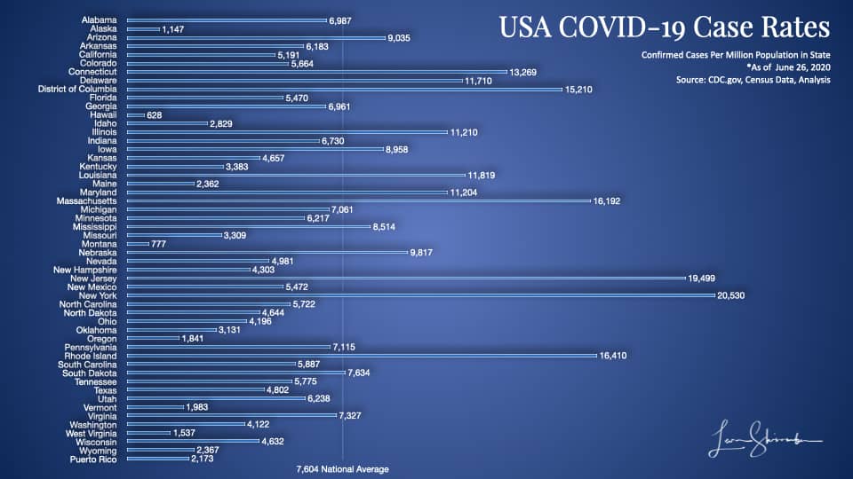
New York has identified more cases per Million population than any other state.
At 20,530, it has done an excellent job of going out and testing. NY is almost three times as much as the national average.
But the problem with cases? We can’t tell if that’s all that exists, or only those found. We just don’t know what proportion of the infected we have identified.
New York may be finding fewer cases because it’s done such an excellent job of testing and finding the infected in the state!
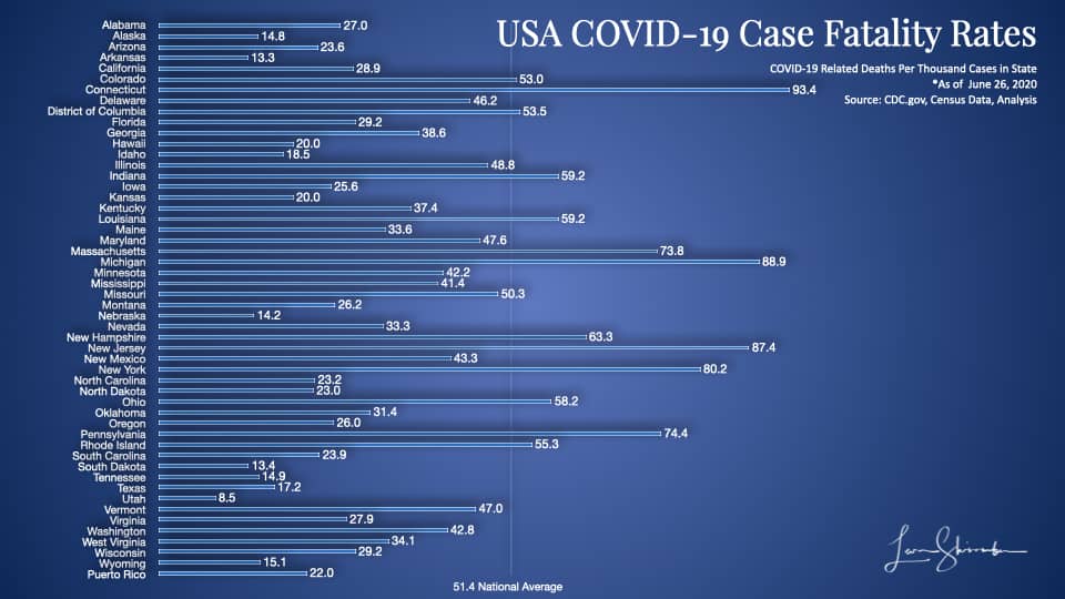
We do know that New York currently has the fourth-highest fatality rate on confirmed cases.
For every thousand confirmed cases, eighty results in fatalities in New York (80.2).
You will notice on this chart that the states sticking out with high numbers include Connecticut (93.4), Massachusetts (88.9), New Jersey (87.4), Pennsylvania (74.4), and Maryland (73.8).
These state Governors did work together on coordinating policy and are closely connected as they have lots of mobile inter-state workers. This closeness may have a lot to do with why their results are so similar. More on this later.
It’s highly likely that New York and these neighboring states have a higher case fatality rate because their confirmed cases include a higher proportion of the elderly.
It looks terrible, but not conclusive is what I would say about the above results.
Well, that’s looking at the metrics that the media likes to talk about.
Now, let’s look at the metrics that relate to our goal of minimizing fatalities among those at risk.
These are the metrics that matter.
First, let’s look at COVID-19 Fatality rates per million 55 years or older.
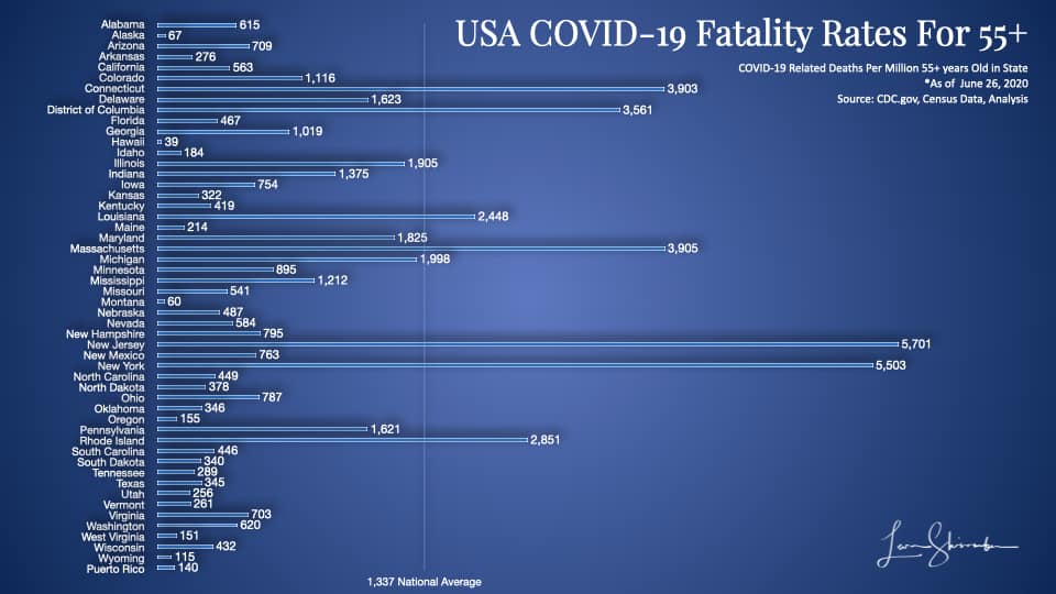
New York has had 5,503 COVID-19 fatalities for every million over 55 in the state.

That number is 10,051 per million 65 and older!
New York is four times higher than the national average on both measures.
New York is only beaten by New Jersey, which operates in the shadow of it’s more famous neighbor, New York.
Note: The 55+ chart is a little more precise than the 65+ chart, but with the 65+, we can compare to countries around the world (as in the charts we showed earlier).
New York’s COVID-19 Fatality rate based on 65 plus population at 10,051 is four times higher than Italy!
Italy, which struggled to acquire needed resources, exceeded its healthcare capacity and frequently cited as among those that had the most difficulty with COVID-19 trounces the New York performance.
Side Note
The New York Governor has recently been quite vocal about Florida’s performance because of their recent spike in cases. This concern, despite Florida explanations that cases are primarily among the young. New York’s fatality rate in the charts above is approximately ten times higher than Floridas.
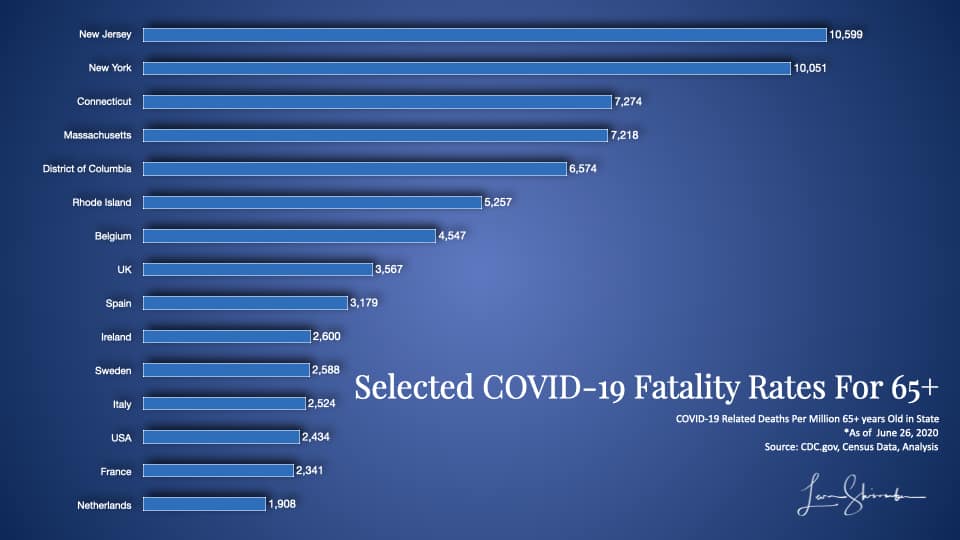
You can compare New York against your favorite state or country and test whether the actual results support your beliefs or assumptions about who did an excellent job.
I think you will be surprised.
Side Note
The New York Governor and the media generally assume New York has done an excellent job, and the Federal Government, or more specifically the President of the United States, has done worse. With New York at 10,051 fatalities per million 65 and older and the USA at 2,434, I would not want to be making that claim. The rest of the USA, without counting New York results, is at 1,939. If you exclude New York and New Jersey the rest of the USA is at 1,679.
To illustrate how far out some of these results were by state, I have created the following matrix, which pinpoints each state using two metrics.
The first is the case fatality rate, or Fatalities per thousand confirmed cases. The further you are to the right, the worse it is.
The second metric is the fatalities per million 55 and over. This metric is on the vertical axis, and the higher you are, the worse your performance.
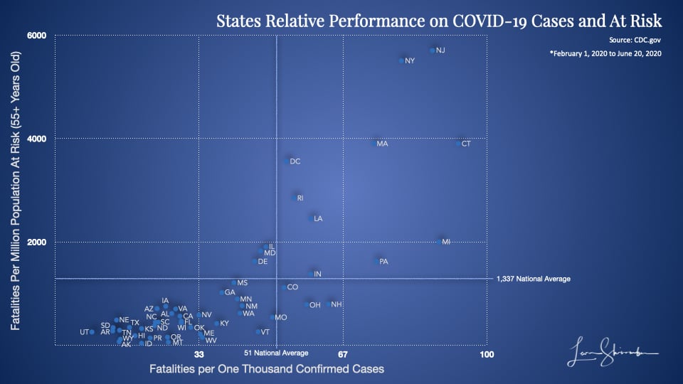
The top right is the worst. The bottom left is best.
Enough said.
Nursing Home Performance – Just Politics?
The Governor of New York early on engaged several prominent consultants and other pundits to help with managing the Pandemic.
They concluded that it would be catastrophic and required additional resources.
In the early stages, the Governor was a leading voice for acquiring more capacity and resources and fought mightily with the Federal Government to secure those assets for New York.
The forecasts were so dire about the shortage of capacity that a floating hospital deployed to New York, and the Army Corps of Engineers equipped a large convention center in New York as a hospital for treating COVID-19.
During this frenzied time, when everyone focused on capacity building and the accelerating cases, the health departments grappled with the question of what to do with residents of Nursing Homes or Long Term Care Facilities. If a resident was infected, should they be sent to a hospital for treatment, or treated in the nursing home? If treated in a hospital, where would the recovering patient be sent?
Concerned that the lengthy stay in a hospital by nursing home residents, and the possibility that capacity would fill up quickly, the Governors and their health departments required that all those nursing facilities readmit their COVID-19 cases.
This decision led to a significant spread of COVID-19 among those nursing home residents.
Later, when confronted with the alarming fatalities in those facilities, and buoyed by the senses that the worst case was not imminent, the Governors reversed course.
Some media outlets picked up the story and started questioning the Governor of New York about his issue.
Here is the Governor on the Nursing home fatalities in New York:
Yeah, look, there’s – I’ve taken political heat, okay? There are facts and there’s politics. There’s no doubt in nursing homes across this nation that’s where we saw most of the deaths. Not most, but almost 50% of the deaths, senior citizens in congregate settings. And it is becoming more and more clear that the infection in the nursing homes came from the staff that got infected and brought it in. But in New York we’re number 46 in the nation in terms of percentage of deaths at nursing homes compared to the total percentage. By the New York Times, we’re number 46. So it’s been unfortunate in every state and we have to do more. We have to figure it out, but if they want to point fingers, not at New York. We’re number 46. You have 45 other states to point fingers at first.
The New York Times, a world-class media outlet, has confirmed that the Governor is right. That New York is ranked 46th lowest among US states in nursing home fatalities as a percent of total deaths.
On that metric, New York was only beaten by Hawaii, which had no nursing home fatalities, and Missouri, and South Dakota that did not report their data.
That’s good, right?
As of June 26, New York had 3,671 nursing home fatalities. Some media outlets have begun to question the integrity of this count due to recent classification changes made by New York not to count nursing home residents who succumbed in a hospital as a nursing home fatality.
But let’s use what we have.
With 24,830 total fatalities, the state had 14.8 percent of its deaths in Nursing home or long term care fatalities.
That proportion is far lower than the 55.8 percent in Maine, as an example.
But does that mean New York was better than Maine at preventing deaths in Nursing homes?
Well, it would be good if it was the right metric.
You see, the percent of your deaths in a nursing home is somewhat dependent on the percent of your elderly residing in nursing homes. More importantly, this metric does not account for severity differences. For example, is a state with only 10 nursing home fatalities considered as bad as a state with 1,000 fatalities if they both had 50 percent of those fatalities in nursing homes?
No, one would have to understand the severity and size of populations to better compare nursing home fatalities.
A far better measure normalizes across every state.
How about the number of nursing home fatalities from COVID-19 per ten thousand residents in nursing home facilities?
With 124,425 residents in a nursing home and long term care facilities, New York COVID-19 lost 292 residents per ten thousand residents.
Maine? 49!
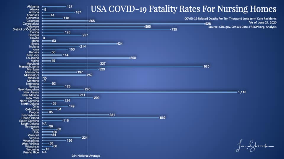
On this chart, New York is 12th highest, not 46th lowest.
Use the wrong metrics to look good.
Use the right metrics to get the right results!
An Important Note
It’s not clear why some of these states’ performance is not getting more scrutiny. New Jersey, show a record of 1,115 fatalities per ten thousand nursing home residents. That means New Jersey has lost more than 11 percent of its nursing home residents to COVID-19!
Side Note
If you want to get a sense of how uncritical the media has been in challenging anyone but the Government Task Force and the President, just read the full transcript of the interview. Look at the questions posed of the Governor. Ask yourself how much critical thinking went into the piece by the New York times giving air cover to the Governors claim?
How well did the strategy work?
From my earlier piece I showed the conceptual goal of a “Flattening the Curve” strategy with these following three charts:
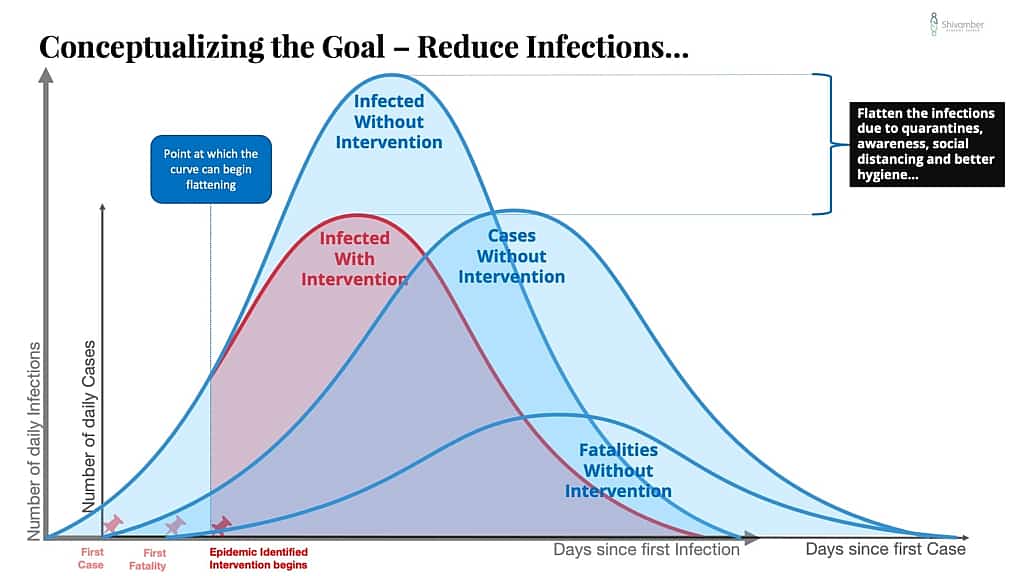
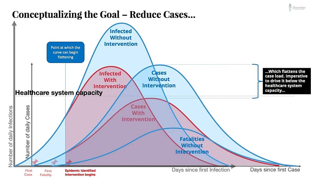
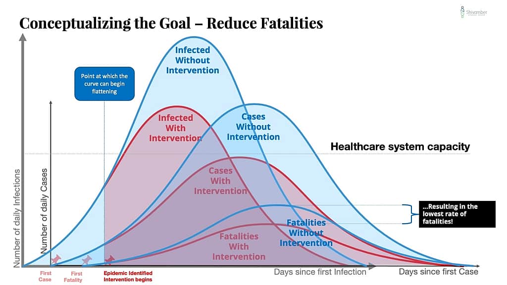
The goal of the strategy was essentially to reduce infections, which would reduce cases, which would reduce hospitalizations below the healthcare system capacity, which would reduce fatalities.
So how did we do?
Well, the goal of reducing hospitalizations below the healthcare system capacity was met.
But while the fatalities were also lowered, it is evident that we did not do enough to isolate the elderly from the infection.
Worse, we may have reduced infections and cases for a while, but the curve is not close to what we were targeting. Compare the chart just above to the chart I showed earlier of the USA Daily COVID-19 Cases and Fatalities (natural scale).
The reality is that our strategy is partially effective, and may no longer be relevant.
In the previous piece I pointed out the following:
What keeps us from a resulting curve that is lower and thinner than no intervention curve?
Here are a few possibilities:
- A mutating virus.
- Reinfections. Newly infected additions to the community.
- Uncontrolled leakage. Primarily due to an inability of the community to implement social distancing and suitable hygiene measures.
- Catastrophic failure. A health care system overwhelmed with cases greater than its capacity to operate effectively.
The strategy to prevent or reduce the spread of COVID-19 must include contingency planning for these and other possibilities.
Policy decisions must force the new curve below the crisis capacity of the health care system, and the system capacity raised.
There are a lot of smart people laser-focused on this problem. I hope that the misinformation driven panic and the emotional tendency to rely on stories does not create missteps.
Against those possibilities outlined, here is my take:
- There are some indications that we do have a mutating virus. Though I am pretty confident this is not the cause of the busted curve.
- reinfections have not been mentioned as much of an issue. I would put this in the remote possibility as a culprit.
- Uncontrolled leakage. Do we need to debate this?
- Catastrophic failure was the issue that occupied everyone early on and has been avoided. My hypothesis is that the extremely high energy spent in combating this issue was to the detriment of dealing with the leakage.
We are now in a situation where we have a busted strategy. Those who are politically inclined will probably claim that early reopening led to the busted strategy.
That may be the cause of increased cases, but does not adequately weigh the enormous cost of keeping the economy closed, or recognize that the strategy was not adequately focused on protecting the elderly.
The right strategy should be based on a foundational understanding that at this point there are two major segments of the population. Those at risk (55 and older represent 29%, over 65 16%), and the rest. We have a couple of choices:
- Return to our broad strategy of a shutdown and strictly enforce it. Or,
- Create a new strategy focused on strict avoidance of transmission to the elderly but looser standards for the rest. This will of course lead to dramatic spikes in cases but not necessarily to hospitalizations and deaths. Or,
- Do what we are doing. Let emotions, media panic, and political interests decide the day.
I know which one I would pick.
What would you do?
Leadership Lessons Learned
Be clear about the goal, and keep your eyes on it.
It’s okay to have multiple objectives, but some are more important than others. If you are not laser-focused on your most important goal and opportunistic about the rest, you will likely end up with mediocre performance.
Choose your metrics carefully.
It’s ok to have many metrics, but remember they are not all equal. The best metrics are balanced, insightful, and directly tied to the results you are trying to achieve.
Results are more important than fame.
Your best performers may not be the best known!
If your strategy is not working review it and change it if necessary
Don’t just pick a strategy and stay wedded to it. Measure it’s success against your expectations. If it’s not delivering what you expected, do the diagnostic to find out what needs to be changed. The strategy might need some tweaks, or it may be the culprit.
Avoid shiny objects!
Shiny objects will kill us all.
In matters of life and death, results are far more important than the show.
That’s also true for the survival of your business!
When businesses are doing well, when they have a long runway, they lose the survival instinct.
Unfortunately, they lose the connection between the actions that matter and their impact on results.
The wrong people get promoted.
The right people leave.
When performance starts deteriorating, they are incapable of diagnosing and fixing the root causes.
If you don’t understand what drives your results, you can’t protect your future.
Or the future of those that depend on you!
Sources and References
https://www.statista.com/statistics/1103688/coronavirus-covid19-deaths-us-by-state/
https://www.census.gov/data/tables/time-series/demo/popest/2010s-state-detail.html
https://docs.google.com/spreadsheets/d/17JmyFzOd3ZEYCGpP0mK5lS_P10yPgCuYF8PYALKuTs8/edit#gid=0
Additional Charts
